An article that I authored on an innovative technique for visualizing multiple data sets from geophysical prospecting.
Paco Link and Luis Barba. (1998). “Combined visualisation of electrical and magnetic surveys” in Filtering, Optimization and Modeling of Geophysical Data in Archaeological Prospecting. Fundazione Lerici, Politecnico di Milano, Italy. p. 103-112. PDF Version.
Abstract
The application of multiple geophysical prospecting techniques to the study of archaeological sites enables synoptic interpretations of complex cultural and natural phenomena before excavation. Magnetic and electrical resistivity surveys are two of the most commonly used techniques in archaeological prospecting due to their economic efficiency and because the resolution the resulting data enables the analysis and prediction of intra-site spatial patterns. The interpretation of magnetic and electrical resistivity survey maps is usually enhanced by visually comparing and contrasting the two data sets. To better enable combined interpretations, the development of innovative techniques for graphical data representation is required to readily visualise the relationship between the two groups of variables. This paper describes the procedures used to create combined visualisations of gradiometer and electrical resistivity surveys maps. Using image processing techniques, a false colour image is constructed based on the HSB (hue-saturation-brightness) colour model. The positive and negative features of gradiometer data are mapped into the hue and saturation components, and the electrical resistivity readings are mapped into the brightness component of the composite image. The results from the geophysical survey of a prehispanic site (Loma Alta, Michoacán) located in the central highlands of Mexico are used to demonstrate the successful application of these procedures.
Introduction
The application of geophysical prospecting techniques to the study of archaeological sites implies the systematic collection of a large number of data readings over a wide surface area. The underlying archaeological phenomena are determined by their unique position in space and by the intra-site relationships existing between them. Seldom is only one high resolution geophysical technique applied in an archaeological prospecting investigation, rather various techniques are utilised in a complementary and integrated manner. An anomalous subsurface feature or condition not detected by one geophysical procedure will often be detected by another. When an anomalous feature is detected by more than one geophysical technique, the significance and interpretation of the anomaly is enhanced and facilitated (Barba 1990, Butler et al 1994).
In order that the meaning of so large a collection of information may be readily appreciated, it is necessary to use methods of graphical display which clearly illustrate the spatial distribution of the data (Cheetham et al 1991). Good methods of presentation should provide a clear but objective view of geophysical data, enabling the user to get a general impression of the overall site, while permitting the examination of any small but significant details that may have been revealed (Aspinall & Haigh 1988). Various graphical methods have been implemented over the years, but the most widely used are univariate distribution maps in which data readings are displayed as the ordered arrangement of variations in intensity or colour over a plan of the survey area. The application of image processing algorithms to enhance the display of geophysical data distribution maps has also been widely documented (Scollar et al 1990, Cheetham et al 1991). As a result, large quantities of locational and thematic information can be stored on a single distribution map and because the human visual system is a very effective image processor, visual analysis and information retrieval can be rapid.
In an attempt to embody the usefulness of the tools and techniques of advanced computer graphics in combination with the increasing bandwidth of sensing equipment, scientific visualisation has emerged as means to capitalize on these two major technological developments. Visualization is more than a method of computing; it is the process of transforming information into a visual form. The resulting visual display enables the reader to visually perceive hidden features in the data but nevertheless are needed for data exploration and analysis. Visual techniques are necessary to understand and explore datasets, and having understood, to communicate and educate. With these improvements also comes the capability of using more and better visual cues to reveal and depict the meaning of data. It is now possible to impart greater meaning to visualization by using visual cues that suggest relationships or relate data to the phenomenon being studied. The challenge now is learning how to efficiently and effectively use these abundant resources and tools to reveal the meaning in the data. We believe that successfully meeting this challenge first requires determining what meaning is to be conveyed in an image and then choosing the technique that best depicts the meaning.
The main objective of this article is to describe the graphical display techniques utilised to visualise electrical and magnetic data as a single colour map. The underlying theoretical foundations of the procedures used to display each type of data set are first described, followed by their combined visualisation. A detailed analysis of the archaeological anomalies observed in the resulting map can be found in the results. The archaeological prospecting investigations and verification excavations which acquired the data used in these examples were fully described by us in Hesse et al (1997) and Carot et al (1998).
Representation of magnetic gradient
Magnetic surveying is one of the most commonly used passive geophysical prospecting techniques. Heimmer (1992) discussed how it’s efficiency and effectiveness enable the spatial integration of high-resolution data acquired over relatively large areas. The rate at which magnetic data can be acquired by modern magnetometers coupled to digital recording units can now easily reach the order of 104readings per day. As a result, real-time data processing and visualisation of the resulting maps has become crucial in guiding field work. Graphical mapping techniques must respond by quickly providing a clear representation of the data which can be readily interpreted.
Magnetic gradient readings taken in non-urban setting generally express a maximum value range on the order of 104, where there is an clear difference in interpretation between positive and negative anomalies. The intrinsic characteristics of this type of data is graphically represented most clearly using a colour encoding scheme. When choosing a colour index for quantitative values of a function, we want effortless perception of the order of the values and clearly perceived boundaries between adjacent levels. Achieving both of these goals is difficult because they play against one another. Colour brings to information more than just codes naming visual nouns—colour is a natural quantifier, with a perceptually continuous (in value and saturation) span of incredible fineness of distinction, at a precision comparable to most measurement (Tufte 1990).
The colour encoding in Figure 1, which can be best described as two hues with varying saturation, represents a good compromise. There are two opposing hues, red and blue. The saturation of the colours decreases as the encoded values move in towards the central value of white, which corresponds zero magnetic gradient. Using two hues and changing just their saturation provides the effortless perception of order. Another advantage to this colour encoding is that the large areas of information background lacking in anomalies are perceived as muted or neutral, allowing the smaller, bright anomalies to stand out most vividly. This scheme was first discussed by Aspinall and Haigh (1988), and is now widely used to represent seismic and magnetic data.
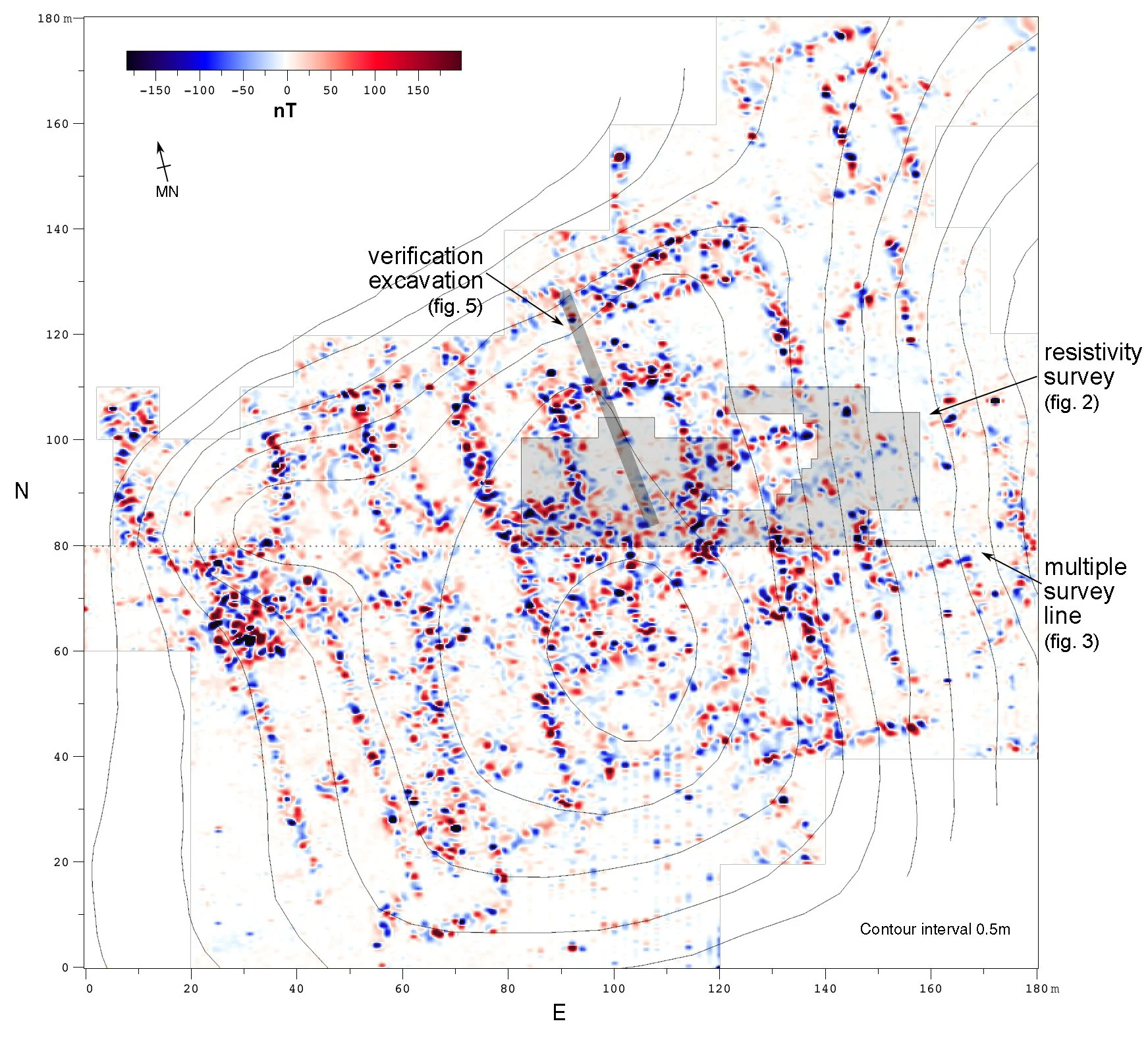
Figure 1. General map of the Loma Alta site magnetic gradient (vertical component) with the topography superimposed. Various areas of investigation are also located.
Representation of electrical resistance
Electrical resistance is expressed as a positive value. Although colour survey maps can be readily derived from this type of data, very useful interpretations can also be obtained from grey scale maps. Varying shades of grey show scalar quantities better than colour because they have a natural visual hierarchy (Tufte 1983). The ambiguity of reading grey scale maps can be minimized by using the clear and effective deployment of redundant signals. Figure 2 exemplifies a sensitive multiplicity: the grey scale fields which encode electrical resistivity are in turn delineated by contours. These lines eliminate edge fluttering and make each field a more coherent whole, minimizing within-field visual variation and maximizing between-field differences. Edge lines allow very fine value distinctions, increasing scale precision (Tufte 1990). This technique has been confirmed by theories of vision, which point out that human cognitive processing gives considerable and often decisive weight to boundaries between different levels of brightness (Netravali and Haskell 1995).
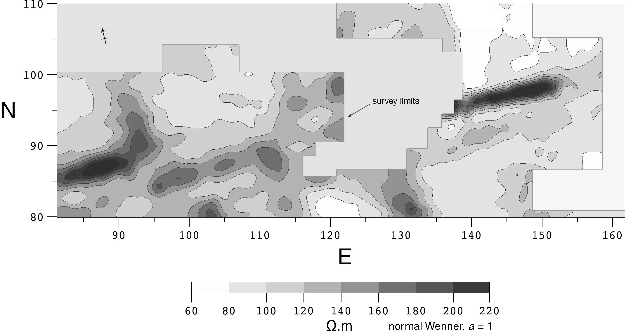
Figure 2. Resistivity map of the central area of the Loma Alta site. The survey was carried out using an east-west arrangement. The irregular shape of the survey was due to limitations imposed by the ongoing excavations at the site.
Combined visualisation
The graphing of multiple data sets collected along a single profile is routine in archaeological prospecting. Figure 3 illustrates this technique, where magnetic gradient and electrical resistivity can be compared and contrasted. Yet this procedure is not easily applicable to surface surveys.
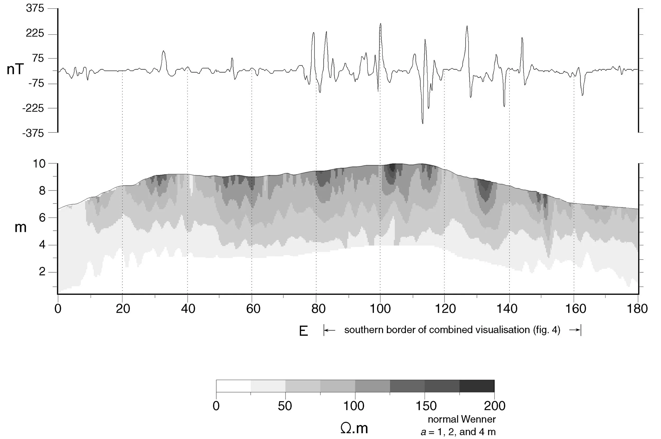
Figure 3. Visualisation of multiple prospection techniques from west to east along the N80 survey profile, as located in Figure 1. Line graph of the vertical component of the magnetic gradient (top), electrical pseudo section adjusted to topographic relief (bottom).
The initial visual comparison of Figures 1 and 2 clearly suggest a high level of correspondence between the two surveys. The main objectives of a combined visualisation of the two data sets should be the selection of a multivariate graphical technique. These procedures range from isolines to three-dimensional surfaces to volume rendering. Innovative techniques for data representation are required to see relationships between groups of variables. This is the area where the generalities are least clear and much research is still necessary, but several solutions have been developed. Icons: the use of complex icons composed of a number of connected line segments – whose lengths, widths and angles each represent one variable – has been explored by Smith et al (1991) with some success. Attribute map: this can be viewed as a colour map of one scalar property on a surface which is either an isosurface derived from a second scalar property (Trwinish and Goettsche 1991) or the geometric surface of an object. Pottinger et al (1990) have developed a technique using both attribute mapping and texture mapping to represent five variables. Barba et al (1998) demonstrated the use of three-dimensional model of topography upon which a second scalar property (magnetic gradient or electrical resistivity) was overlaid as a texture map.
Aspinall and Haigh (1998) suggested the use of different colour planes for each source of information to be combined. In all 50 or so systems of colour organisation, every colour is located in a three-dimensional space: described by hue, saturation, and value in Munsell and other spatial-perceptual classifications; by red, green, and blue components in various additive methods for video displays; and by cyan, magenta, and yellow components in subtractive methods for printing inks. The challenge is to utilise colour’s inherently multidimensional quality to express multidimensional information.
Keller and Keller (1993) documented some of the earliest examples of binary colour keys (variation of hue and saturation) to display two dependant and two independent variables. This technique was first applied to archaeological prospecting by Hesse et al (1997) to represent magnetic and electrical surveys maps. This article is the full development of this initial experiment.
Methodology
The data from the entire local magnetic gradient survey were non-linearly transformed using arctangent compression (Scollar et al 1990), bi-cubically resampled, and visualised as a colour raster image. Missing electrical resistivity data was interpolated using Kriging and the final data set was visualised as a grey scale raster image with logarithmically scaled grey levels.
Combined visualisation
The colour scale of the magnetic data varies in hue and saturation, whereas the electrical data is represented using a brightness colour scale (grey scale). Several commercial computer applications can load this type of data and represent it as a composite image. Two solutions are presented here: the first involves numerical processing and visualisation using Interactive Data Language (IDL v5.1, Research Systems Inc., Boulder, CO) which is very robust but which requires a high level of programming expertise. In this case, the magnetic data is loaded into an array and displayed as a colour raster image using the blue-white-red colour scheme described above. This image is then decomposed using the COLOR_CONVERT command into two separate arrays, one with the corresponding hue component and another with the saturation component. The electrical data is loaded into a third image array, and finally the three variables are displayed using the TV or TVLCT command.
A visual and more direct solution uses Transform (v3.4, Fortner Research LLC, Sterling, VA) and Photoshop (v5, Adobe Systems Inc., Seattle, WA), but lacks the numerical robustness of IDL. Magnetic data is displayed in Transform as a raster image with the blue-white-red colour table and then it is saved to disk as a TIFF file. The electrical survey map is prepared in the same manner, but using a grey scale colour table. In Photoshop each image is loaded into a separate layer, with the magnetic data below the electric. Finally, the opacity of the electrical map is modified using the MULTIPLY (70-85%) transformation.
The end result is the same either way: each cell is coloured according to a blue to red colour spectrum to represent the local magnetic gradient: blue, minima; red, maxima. The colour saturation changes from low (saturated colour) to high (pale or grey) to show the magnitude of electrical resistance of each cell. A binary colour key can be added to show the relative magnetic and electrical values.
Results and discussion
The dipole anomalies illustrated by the false-coloured maps of the vertical gradient in Figures 1 and 4 are due to the high contrast in magnetic properties between the lacustrine sediment matrix and buried stones of volcanic origin. In most cases, the anomalies form straight lines which can be identified as the responses of buried stone walls. The dipoles of magnetisation are in disorder and the stones forming the upper parts of the edifications, those closest to the surface, produce stronger randomly oriented anomalies. These images are representative of this disorder: they do not permit an accurate association between pairs of blue and red lobes to individual stones but behaves like a realistic (or even ‘impressionist’) representation of the underlying stones (Hesse et al 1997).
The main goal of the electric study was to verify the symmetry of a central platform partially located by an ongoing excavation and which the magnetic survey had fully discovered. Despite improvements in the field work speed proposed by Hesse and Spahos (1979) and digital recording methods, electrical resistivity maps are always more time consuming than gradiometric surveys, but provide a high degree of discrimination. This difference in the acquisition speed limited the extension of the electric survey. In addition, the irregular form of the studied area was due to the ongoing excavations. In the case of the magnetic map, the missing data for this area was acquired one year later, after it had been reburied.
The size and concentration of stones forming the stairways and foundation walls produced high electric readings. As seen in Figure 1, the central part of the architectural complex produced stronger magnetic and electric readings. This is directly related to the width and depth of the walls. In the south-western part of the site (Figure 1) the magnetic survey located narrow lines of anomalies which correspond to thin structural or containment walls, but which present no significant electric response. Only more significant accumulations of stones (detected as several magnetic dipoles added together) present notable electrical anomalies.
The juxtaposition of magnetic and electric maps in Figure 4 is remarkable. The combined visualisation clearly delineates the southern portion of a large square structure which has been interpreted as a sunken patio. At the centre of the patio a dipole anomaly is clearly visible and was also detected by electric resistivity. Later verification excavations discussed by Carot et al (1998) discovered a central altar at this point (Figure 4 and 5, point B) and stairways (Figure 4 and 5, point A) leading down to the patio. At the south-western corner of the combined visualisation (point C) a double line of strong magnetic dipoles can be observed, but just single line of high electric values. The high correspondence between the two survey maps clearly indicates that the buried anomaly must be of significant mass and dimensions. A symmetrical magnetic anomaly can be observed at point D and when excavated revealed the upper level of a flight of stone stairs which lead to the top of the platform which surrounds the sunken patio. The absence of a second parallel anomaly below point D can be attributed to alterations of the soil matrix by the excavations which had limited the electrical survey and due to differences in construction techniques. The linear anomaly at point E only manifests itself in the electrical survey layer. It is attributed to a previous excavation trench which altered the soil matrix.
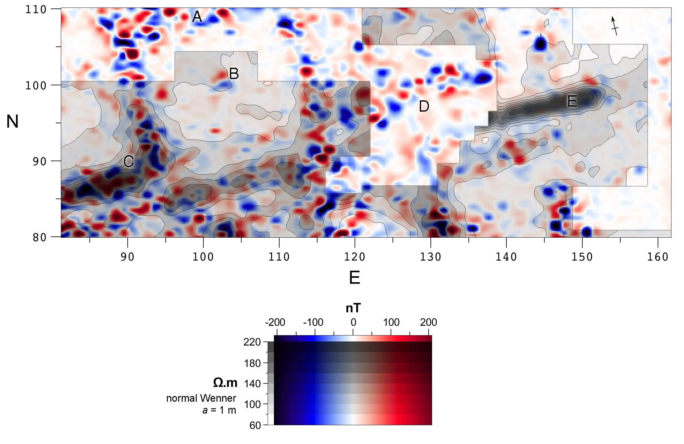
Figure 4. Combined visualisation of electrical and magnetic data. The anomalies at points A to E are discussed in the Results section of the article.
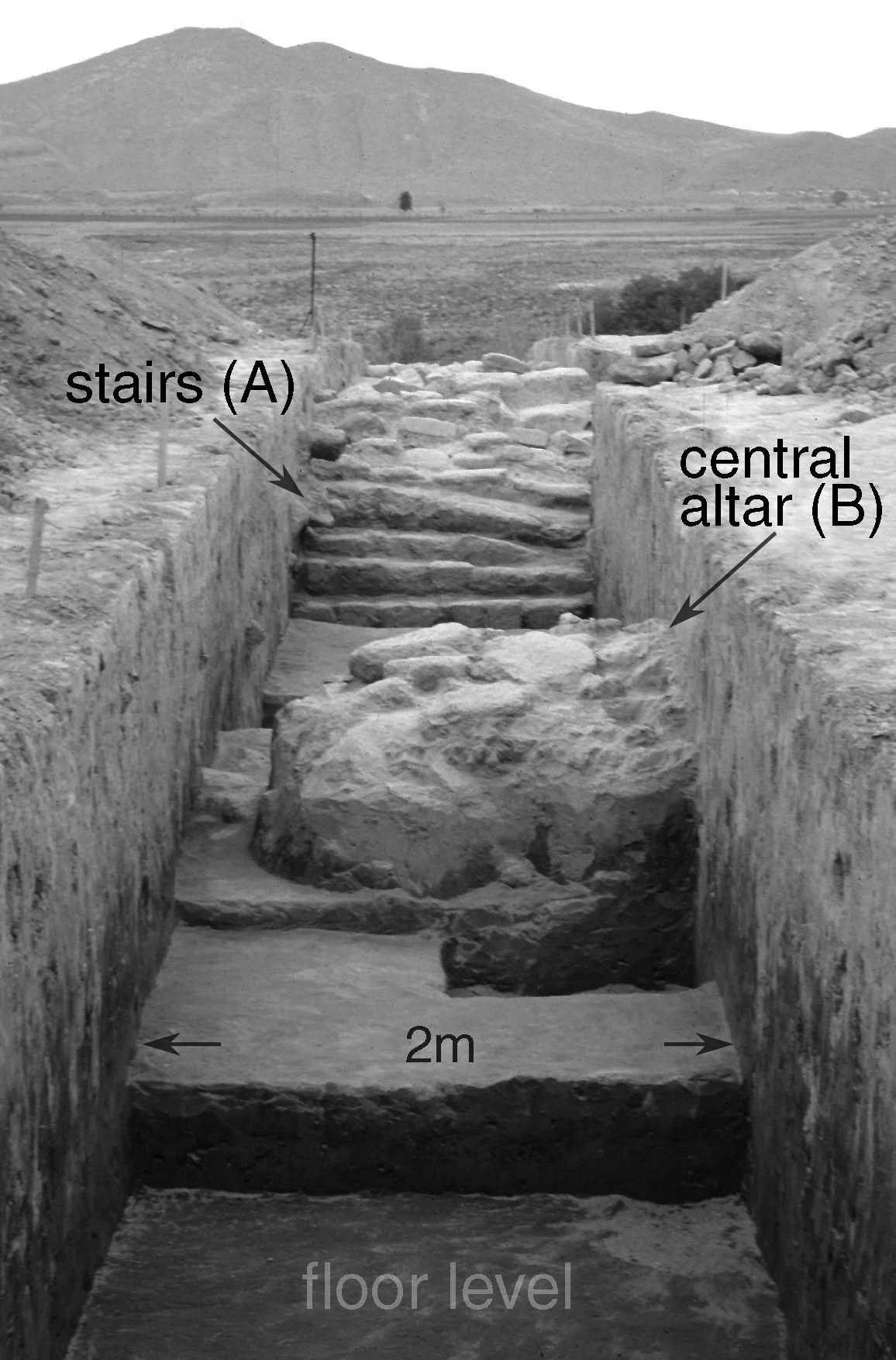
Figure 5. View of a verification trench (looking north) across the central area of the sunken patio. The localisation of this excavation can be found in Figure 1.
Conclusions
“Preliminary information about a site, in advance of excavation, may come from several different sources–from different forms of geophysics, such a resistance or magnetometry, from micro-topography surveys, from surface collection, and from aerial photography. Each source provides a characteristic type of information and is capable of producing its own site plan; in order to gain maximum advantage from the overall set of data, it is necessary to be able to compare and contrast the various plans.” (Aspinall and Haigh 1988, p. 306)
The techniques described here fulfil the goals of multivariate visualisation: better visual cues are derived to reveal and depict the meaning of multiple data sets within a single image. Further research will fully explain the physical phenomena behind the high correlation between the electrical and magnetic surveys. Additional implementations of this technique to surveys from other contexts will surely follow. In general, the extensive implementation of magnetometer surveying due to its advantages of speed and ease of ground coverage is complemented by electrical techniques when applied to specific areas and problems. The combined visualisation of the two techniques resulted in an innovative image of the central ceremonial structures enabling better interpretations of the anomalies, which led to a more precise archaeological excavation.
Acknowledgements
To Albert Hesse and Agustín Ortiz for their participation in the field work and research. Our thanks to Drs Patricia Carot, Marie-France Fauvet-Berthelot and Charlotte Arnauld for their invitation to participate in the Loma Alta Project.
References
Aspinall, A. and Haigh, J.G.B., 1988. A review of techniques for the graphical display of geophysical data. In: Computer and Quantitative Methods in Archaeology, 1988., Ed. S.P.Q. Rahtz & J. Richards, British Archaeological Reports, International Series 446, Oxford, pp. 295-307.
Barba, L. 1990. Radiografía de un sitio arqueológico. IIA-UNAM, Mexico City.
Barba, L., lazos, L., Link, P., Ortiz, A., López, L., 1998. Arqueometría en la Casa de las Águilas. Arqueología Mexicana, Vol. 6, No. 31, pp. 20-27.
Butler, D.K., Simms, J.E. and Cook, D.S, 1994. Archaeological Geophysics Investigation of the Wright Brothers 1910 Hangar Site. Geoarchaeology, 9: 437-466.
Carot, P., Fauvet Berthelot, M.F., Barba, L., Link, P., Ortiz, A., Hesse, A., 1998. La arquitectura de Loma Alta, Zacapu, Michoacán. In El occidente de México: arqueología, historia y medio ambiente. Actas del IV Coloquio Internacional de Occidentalistas. Universidad de Guadalajara, Instituto Francés de Investigación Científica para el Desarrollo en Cooperación (ORSTOM), Guadalajara, Mexico, pp. 345-362.
Cheetham, P.N., Haigh, J.G.B., and Ipson, S.S., 1991. The archaeological perception of geophysical data. In Archaeological Sciences 1989: Proceedings of a conference on the application of scientific techniques to archaeology, Bradford, September 1989. Ed. P. Budd et al., Oxbow Monograph 9, Oxford, pp. 273-287
Heimmer, D.H., 1992. Near-surface, High Resolution Geophysical Methods for Cultural Resource Management and Archaeological Investigations.Report prepared for the National Park Service, Denver, Colorado, Geo-Recovery Systems Inc.
Hesse, A. and Spahos, Y., 1979. The evaluation of Wenner and dipole-dipole resistivity measurements and the use of a new switch for archaeological field work, Archaeo-Physika, 10, 647-55.
Hesse, A., Barba, L., Link, P., and Ortiz, A., 1997. A Magnetic and Electrical Study of Archaeological Structures at Loma Alta, Michoacan, Mexico. Archaeological Prospection, 4: 53-67.
Keller, P. and Keller, M., 1993. Visual Cues: Practical Data Visualization. IEEE Computer Society Press, Los Alamitos, CA.
Netravali, A. and Haskell, B., 1995. Digital pictures: representation, compression, and standards. Plenum Press, New York.
Pottinger, D., Todd, S.J.P., RodriguesI., Mullin, T. and Skeldon, A., 1990. Phase portraits for parametrically exited pendula: an exercise in multidimensional data visualization. Technical Report Number 213, IBM UK Scientific Centre, Winchester, UK.
Scollar, I., Tabbagh, A., Hesse, A., and Herzog, I., 1990. Archaeological Prospecting and Remote Sensing. Cambridge Unversity Press, New York.
Smith, S., Grinstein, G. and Pickett, R., 1991. Global geometric, sound and color controls for iconographic displays of scientific data. In Farrell, E.J. (ed.), Extracting Meaning from Complex Data: Processing, Display, Interaction II. Proceedings of SPIE Conference, 26-28 Febuary 1991, San Jose, CA, Vol. 1459, pp.192-206. SPIE, Bellingham, WA.
Treinish, L.A. and Goettsche, C., 1991. Correlative visualization techniques for multidimensional data. IBM Journal of Research and Development, 35(1/2):184-204.
Tufte, E. 1983. The Visual Display of Quantitative Information, Graphics Press, Cheshire, Connecticut.
Tufte, E. 1990. Envisioning Information, Graphics Press, Cheshire, Connecticut.